Production Designer Michael Pickwoad on the new TARDIS... and more! (Part Two)

The Doctor Who Team
Question: What was uppermost in your mind when you designed the new TARDIS?
Michael Pickwoad: The design of the main ribs was the most crucial feature as they needed to support the gallery without obstructing floor space and be a shape that suggested high technology, but of an organic nature that would sweep from the floor to the central rotor like a magnetic field diagram. Their shape is a blend of straight lines and sweeping curves connected by sharper curves that give it a definite and particular profile, and although they are large, the structure still has a sense of delicacy and precision. The use of steel allowed this delicacy and the surface was finished in a cosmic blue, suggesting a unique Gallifreyan alloy.
Various numbers of ribs were experimented with in the drawing stage, and with twenty ribs being too intense and sixteen being too far apart and out of balance with the intended scale, eighteen appeared to be just right. The overall size of the new TARDIS is the same as the last, but appears to be larger as all of the space is accessible.
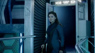
The entrance was designed to make the arrival within the space, rather than on the edge, and give a sense of weightlessness by not being aware of how the bridge to the console platform is supported.
The staircases connecting the different levels, all in different directions, take on the essence of an Escher drawing and were designed to give a confusing yet magical look.
The new design incorporates enough lights as part of the design to basically light the set for wide shots. They can be made to chase round the set to give a sense of motion or acceleration, and turn red for danger. The pairs of blue and amber circular lights on the gallery were based on Dalek head rings, a not inapposite reference for TARDIS evolution.
The console itself returned to more of the look of earlier designs, allowing for more positive technology, veering away from the whimsical, yet retaining a sense of entertainment. This may be considered retro, but allows for a greater range of controls and levers that can be combined with touch screens and computer panels, which in themselves have less shape. The Doctor, of course, always needs a lever.
Tomorrow we’ll be bringing you the third and final part of the interview in which Michael discusses his favourite element of the new TARDIS and other sets he’s designed for Doctor Who.
READ PART ONE OF OUR MICHAEL PICKWOAD INTERVIEW
READ PART THREE OF OUR MICHAEL PICKWOAD INTERVIEW